Graphing: Scale and Origin
Most often, when we use a coordinate graph , each mark on the axis represents one unit, and we place the origin—the point —at the center.
However, sometimes, if we have coordinates that are large numbers, we may need to
scale
the axes differently. In the graph below, each mark on the axis represents
units.
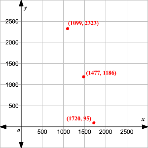
Also, note that since none of our coordinates were negative, we placed the origin in the bottom left, instead of the center.
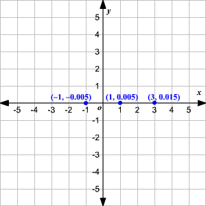
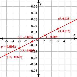
In other situations, we may need to scale the -axis and the -axis differently.
For example, consider the line . If we graph it on a normal grid, with intervals of unit on both axes, we can hardly see it as it’s too close to the -axis.
Even if we zoom in, it doesn’t solve the problem.
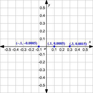
However, if we use an interval of on the -axis, and an interval of on the -axis, it’s easier to see the line.
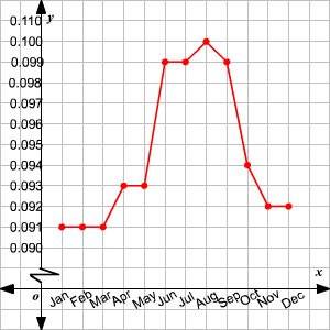
Sometimes, when we want to show changes over a small range of and/or values, it's hard to avoid having lots of blank space in a graph. The example below shows one way to deal with this.
Example:
The table shows the average price of electricity per kilowatt-hour in various months in the year .
| Month | Jan | Feb | Mar | Apr | May | Jun |
|---|---|---|---|---|---|---|
| Price ($) |
| Month | Jul | Aug | Sep | Oct | Nov | Dec |
|---|---|---|---|---|---|---|
| Price ($) |
(Source: Consumer Price Index-Average Price Data, Bureau of Labor Statistics.)
If we want to draw a line graph to analyze the price variations, what scales of the axes should be used?
Note that the prices are precise to three decimal places, and are all clustered in the range .
If we scale the -axis in units of , all the action occurs in a tiny part of the image.
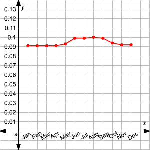
In this case you can use a jagged line just above the origin on the -axis to indicate that some -values are not shown, and then use a finer scale of on the -axis.