Interpreting Data
Data can be visually represented in many ways. We use bar graphs , line graphs , and circle graphs to present data in a visual way.
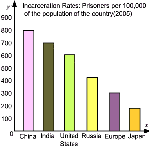
Bar Graphs
A bar graph is used to display the frequency of data in categories , using vertical or horizontal bars. You can easily compare the categories using a bar graph. The bar graph below shows the incarceration rates of different countries. Prisoners per of the population of the country( ).
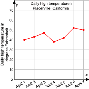
Line Graphs
Line graphs usually show how values change over a period of time . A line graph displays data using line segments.
The line graph below shows the daily high temperature of Placerville , California recorded over a week.
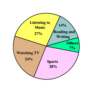
Circle Graphs
Circle graph is used to compare parts of the data to the whole . The entire circle represents of the data and each sector represents a percent of the total.
The circle graph below shows the results of a survey that asked teen hobbies, ages to .