Scatter Plots
A scatter plot can be used for data in the form of ordered pairs of numbers. The result will be a bunch of points "scattered" around the plane.
If the general tendency is for the points to rise from the left to the right of the graph, then we say there is a positive correlation between the two variables measured. If the points tend to fall from the left to the right of the graph, we say there is negative correlation . If there is no general tendency, then there is no correlation .
If the tendency is not very pronounced – that is, the points are scattered widely – then we say the variables are weakly correlated . If the correlation is more pronounced, we say the variables are strongly correlated .
|
|
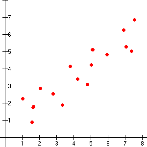
Weak positive correlation
|
|
|
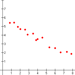
Strong negative correlation
|
|
|
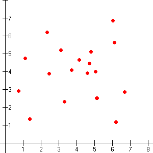
No correlation
|
Examples:
If you graphed a person's height on one axis and their weight on the other, you would probably get a strong positive correlation (because taller people generally weigh more).
If you graphed a man's age and the number of hairs on his head, you would probably get a weak negative correlation (because some men have a tendency for baldness as they get older).
If you graphed a woman's shoe size and the length of her hair, you would probably get no correlation. (These variables are unrelated.)


